
Web design has become one of the most in-demand professions in the global web designing market. As a result, the compensation of a Web designer in India is rising rapidly. In many aspects, site design is at the heart of technology advancements, and web designers are at the forefront of the technological revolution. Because of the strong demand, web designer salaries in India are among the highest globally.
In India, web designers are paid around 2 .5 to 3.5 lakhs per year. According to the survey, the demand for web designers has increased to 35%, and now more than 1 billion web designers are required in global markets. Predominantly, web designers are highly in demand in digital marketing.
Moreover, Web designers build, design, and develop websites by employing their imaginative and software engineering/programming skills. They are acquainted with user experience and create websites that ease comprehending, accessing, and operating while adhering to design standards and criteria. A front-end developer is another name for them.
Web designers are in response to making websites dynamic, engaging, and appealing while also giving clients access to the information they want. Web design needs advanced coding and management.
If you are interested in beginning your career as a website designer, you can join Web Designing Course In Chennai to have a profound understanding of what is responsive design, what is responsive web design, mobile web design, etc.
In this blog, we shall discuss mobile website design, mobile responsive, and responsive design.
What is responsive design
In website designing, designers face the complication of never-ending new resolutions and devices in Web design and development. For many websites, developing a website version for each screen and device would be impossible or at the very least impracticable.
Responsive Web design proposes that the design and development should respond to the user's behavior and environment, considering the screen size, features, and platform.
Flexible layouts and designs, images, and judicious use of CSS media queries are all part of the process. When a user switches from a laptop to an iPad, the webpage should adapt to the new device's display, picture size, and coding capabilities.
Moreover, The user's device settings may also need to be considered; for example, if the user has a VPN for iOS on their iPad, the site should not limit its access to the website. In other words, the site should be equipped with technology that allows it to respond to the user's choices automatically. It would reduce the need for each new product to go through a distinct design and development process.
If you want to become a web designer, you can join a Web Designing Course in Bangalore to have an in-depth understanding of mobile website design, mobile responsive, what is responsive design, etc.
The Concept Of Responsive Web Design
Responsive web design (RWD) is a website development technique that allows a website's appearance to vary dynamically depending on the screen size and the gadget that is used to access it. RWD is one solution for the designer who designs a wide range of devices that users can access, from little phones to large desktop monitors.
However, responsive Web design is more than resizable graphics and flexible screen dimensions; it's a whole different way of thinking about design. Let's speak about all of these features and some upcoming ideas.
Adjusting Screen Resolution
As screen resolution advances year after year, each of these devices may be able to accommodate changes in size, capability, and even color. Moreover, some would be in landscape mode, while others are in portrait mode and square. As evidenced by the increasing popularity of the iPhone, iPad, and modern phones, many new technologies can switch from portrait to landscape mode.
We must also acknowledge the thousands of different screen widths and plan for landscape and portrait.
If you are interested in UI UX Design, you can take a UI UX Design Course In Chennai to have mobile website design, Navigation - Different Types, Sorting Tools, Card sorting and Reverse card sorting, etc.
Part of the solution: Flexibility
Images can now be automatically altered, and we have solutions to ensure that layouts do not break. While it is not a perfect answer, it does provide us with a lot more possibilities. It is ideal for devices that instantly convert from portrait to landscape position or for users who switch from a huge computer screen to an iPad.
Ethan Marcotte provided a sample Web design using this more flexible layout:
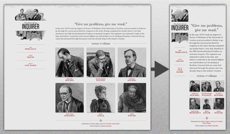
The whole responsive design is a good blend of fluid grids, photographs, and smart markups. So, Creating fluid grids is a particularly common practice, and there are several strategies for doing so:
-
Parts of images are hidden and shown.
-
Putting Together Sliding Composite Images
-
Images in the foreground that fit with the layout
For gathering more information, you can Check out Zoe Mickley Gillenwater's book "Flexible Web Design: Developing Liquid and Elastic Layouts with CSS" and download the sample chapter "Creating Flexible Images."
For example, you can look at this image:

The image would look to be of poor quality if the image shrunk too small. So, clipping it off was not crucial to keep the domain name more visible. As a result, the image is split into two parts: one as a background that will be shrunk and maintained in length, and the other (name) that will be resized correspondingly.
The illustration can be used as a background in the h1 element, and the image is adjusted according to the heading.
It is one method of responsive Web design work.
Even with clever adjustments, a layout might become too narrow or short to be appealing. In the above logo, you could understand that it would be not to crop half of the illustration or keep the logo from becoming unreadable and "floating" up.
Flexible Images
The ability to deal with images is an important aspect of responsive Web design. There are various methods for scaling photos proportionally, several of which are simple to use. The most popular method is to use CSS's max-width for a straightforward solution, which was first studied by Richard Rutter and discussed in Ethan Marcotte's piece on fluid pictures.
Unless the viewing area gets less than the image's initial width, every image will load in its original size as long as no other width-based image styles override this rule. The image's maximum width is set to 100% of the screen or browser width, thus the image shrinks as the percentage decreases.
So, it is not necessary to write your code about your height and width. Instead, use CSS to regulate the relative size of the images as the browser resizes them as needed." It is a unique and simple method for resizing photographs to perfection. Make a note that max-width is not supported in IE.
While the above is a great quick fix and a good way to start with responsive photographs, image resolution, and download rates are the most crucial aspects to consider. While reducing an image for mobile devices is simple, creating an image for large devices will significantly slow download times and consume the storage space.
If you want to become a web designer, you can join Web Designing Course Online to have an in-depth understanding of what is responsive web design, mobile web design, mobile website design and Web Designing.
Stop Iphone Simulator Image Resizing
Web designs for the iPhone and iPod Touch automatically rescale to accommodate the small screen, a useful property. A full-sized design would just shrink accordingly for the tiny browser, without the need for scrolling or a mobile version unless otherwise specified. The user can then zoom in and out as needed.
However, when responsive Web design became prominent, many noticed that graphics changed proportionally with the page, even if they were designed for the small screen. Due to this, text and other elements were consequently scaled down.

We can fix the problem by using an Apple-specific meta tag and placing it underneath the web site's head> section, and it can work only with Apple's simulator.
Custom Layout Structure
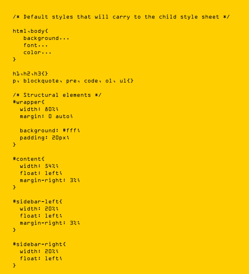
We may need to modify the layout entirely for significant size changes, either using a new style sheet or CSS media query. This doesn't have to be a hassle, but separate style sheets can adopt these styles and use floats, widths, and heights to shift elements around.
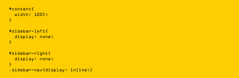
For example, we could define all of the essential structural components, such as #wrapper, #content, #sidebar, #nav, and colors, backgrounds, and typography, in a single main style sheet (which would also be the default). It's also possible to set default flexible widths and floats.
We might recognize this and transition to a new stylesheet if a style sheet provided a layout that was too biassed, short, broad, or tall. This new style sheet would take everything from the default style sheet and completely restructure the layout.
Here is the style.css (default) content
Here is the mobile.css (new) content
Media Queries and CSS3 Media Queries
A typical way of sending a customized style sheet to desktops, laptops, tablets, and mobile phones is to use media queries. Media queries can also be used to indicate that certain styles are only for printed material or for screen readers; the media type such as print, screen, or speech).
CSS3 is compatible with all of the same media styles as CSS, including screen, print, and handheld. Despite this, it offers several unique media properties, including max-width, device-width, orientation, and color. After the release of CSS3, new gadgets (such as iPads and Android handsets) will support media features. So, to target these devices, calling a media query utilizing CSS3 features would suffice, and it would be disregarded if visited by an older computer browser that does not support CSS3.
Javascript
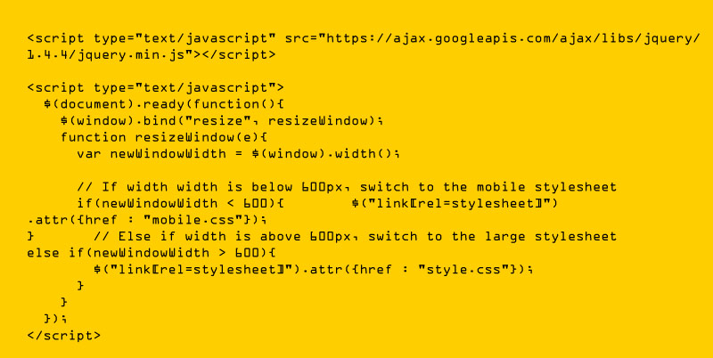
JavaScript is another option, particularly for devices that do not support all CSS3 media query capabilities. Older browsers (IE 5+, Firefox 1+, Safari 2) can now use CSS3 media queries with a pre-made JavaScript library. If you currently use these queries, download the library and add it in the markup: css3-mediaqueries.js.
If you choose a more hands-on technique, here's a sample jQuery snippet that identifies browser width and adjusts the style sheet accordingly:
To have profound understanding, you can Javascript Training In Bangalore to have comprehensive understanding of Variables, Functions, Conditions, HTML, CSS3, Loops, Syntax, and DOM Scripting
Hiding Content
As a display shrinks, it's feasible to proportionally downsize objects and reorder pieces as needed to make everything fit (relatively well). That's great, but making every piece of material from a huge screen available on a smaller screen or mobile device isn't necessarily the ideal option. For mobile settings, we apply best practices such as easier navigation, more focused information, and lists or rows instead of several columns.
Responsive web design is about how we develop a flexible layout on several platforms and screen sizes. It is also about the user's ability to select content. However, CSS has made it simple to show and conceal content for many years.
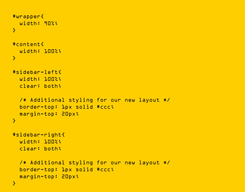
In addition, the HTML block element must be hidden in a separate style sheet or detected using JavaScript. We can hide content in our default style sheet that can be seen on mobile versions or smaller devices, and we can also hide content on smaller screens. As we hide essential pieces of material, we could replace them with navigation to that content or a different navigation structure entirely.
We didn't use visibility because it merely hides the content, whereas the display property removes it entirely. There's no need to keep the markup on the page for smaller devices; it only wastes resources and may cause unnecessary scrolling or distort the layout.
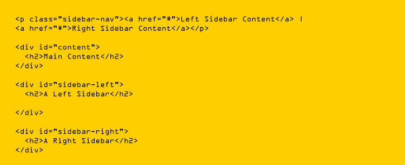
Here is our markup
Here is the style.css (default) content
Now, the two sidebars are hidden, and the links to these pieces of information are visible. When the links are clicked, the sidebars could be repositioned in the CSS to float below the text, and the links could invoke JavaScript to cancel the display.
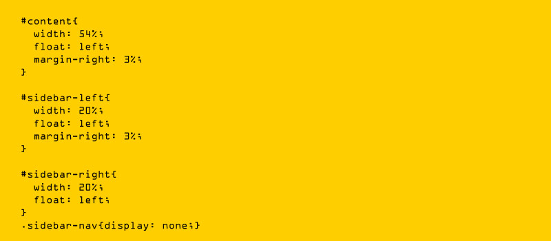
Here is the mobile.css (simpler) content
With the ability to show and conceal content instantaneously, reorganize layout elements, dynamically scale photos, structural elements, and more, a design may be modified to meet a wide range of screen sizes and device kinds. As a result, when the screen gets smaller, it restructures objects to follow mobile rules. Use a script or alternate style sheet, for example, to improve white space or replace image navigation sources on mobile devices for better usability (icons would be more beneficial on smaller screens).
Touchscreens VS Cursors
Touchscreens are becoming more and more prevalent. It's logical to assume that smaller gadgets are more likely to get touchscreen technology. Touchscreens are mostly found on smaller devices, but many desktops and computers on the market have touchscreen ability. The HP Touchsmart tm2t, for example, is a simple touchscreen laptop with a standard keyboard and mouse that can also be used as a tablet.
Touchscreens have distinct design standards than simply cursor-based interactions, and they also have various capabilities. However, creating a design that fits both is not difficult; but CSS hovers can't be displayed on a touchscreen since there's no cursor; instead, customers click as they use the screen. As a result, relying on CSS hovers won't be beneficial because they can be used for cursor-based devices.
Many of the design concepts are ideally equipped to touchscreens, but they aren't necessarily incompatible with cursor-based usability. Although most people are right-handed, sub-navigation on the right side of the page would be more user-friendly for touchscreen users, as they would not unintentionally touch or swipe the navigation with their left hand when holding the device. This demonstrates that the cursor user will not notice much difference.
Responsive Web Design
Responsive web design is unquestionably a popular topic in the world of web design. Because site users are increasingly diversifying their methods of visiting a website, the popularity of the concept of responsive web design is well-deserved to some extent. We live in a time where our online designs must work across various platforms, including iPads, iPhones, Android phones, desktops, and netbooks.
Responsive Web Design's Key Features
A web design must have three fundamental elements to be deemed "responsive." These aspects are described as follows by web designer/developer Ethan Marcotte, the author who invented responsive web design:
-
The site must be designed on a flexible grid foundation.
-
The images that are used in the design must be adaptable as well.
-
Media queries must be used to enable various views in different contexts.
CSS-Tricks' site layout changes depending on the viewport size of the browser. It is essential to notice that all three features are implemented in a responsive web design.
Let's look at these three aspects to see how they interact to create a fully responsive and functional website.
Flexible Grid
In terms of web design, the term grid is becoming more ambiguous. The requirement for a flexible grid on your site does not imply that you must choose one of the dozen or so excellent grid solutions available. The ideal answer for a web design is frequently to define your own parameters for columns, spacing, and containers, which can be just as flexible as any existing system.
In fact, most existing grid systems confine size, spacing, and alignment to CSS classes. Imposing these constraints on a responsive web design is more complicated and time-consuming than designing your grid. The mechanics of your layout sizes and spacing are the most crucial component of a flexible grid system, whether you are using a readymade grid system or building a unique solution.
This means sacrificing our pixels in favor of web layouts based on percentages and ems, which are relative measurement units for site designers. Of course, this does not rule out the use of pixels in image editing software (i.e., Photoshop, Fireworks, etc).
Instead, as we convert our pixels into web layouts that use a relative unit of measurement, an additional step involving a little bit of arithmetic becomes a part of the web design stage.
By this image, you would have understood the layout.
Flexible Images
Another important component of a responsive site design is images that shift and scale with our flexible grid. Flexible pictures are difficult for web designers to work with. Whenever we want more area for text content on smaller browsing devices, we need not bring in large or oversized images; instead, we scale down using width and height HTML elements. But, it is not a smart practice for faster web page load times.
We can also have multiple image versions on the server and dynamically provide the appropriately sized version based on the user agent utilizing server-side or client-side feature detection with DOM manipulation.
Finally, Web design and development has entered a new era. There are too many possibilities now, and there will be far too many in the future to keep tweaking and customizing solutions for each screen size, device, and technological innovation. Instead, we should head into a new age by building future-proof websites. It doesn't take much time or effort to learn how to create a design user-responsive, and it's a bit stressful and time-consuming than understanding how to develop, design and program for every feasible device. So, to learn more about website designing, you can join a web designing course and impart the necessary concepts such as what is responsive design, responsive web design, mobile web design, and mobile responsive.
Moreover, you can join UI UX Training In Bangalore to acquire UX vs. UI, UX and its Future, etc. The strategies outlined above and responsive Web design are not the complete answer to the ever-changing mobile market. Responsive Web design is a concept that can enhance customer experience when it is used properly, but it does not address the problem for every user, gadget, or platform. We will have to continuously experiment with existing devices, displays, and capabilities to maximise the user experience as technology evolves every year.
Moreover, to have a comprehensive understanding of responsive web design, you can join a web designing course to acquire a profound knowledge of mobile responsive, mobile web design, what is responsive design, etc.